BONHOMIE
Home
About me
Resume (PDF)
FEATURED PROJECTS
Influitive
quintly
AM Radio
OTHER WORK
Joe Fresh
Photography
See all...
quintly is a bootstrapped SaaS start-up based in Cologne, Germany that provides an advanced social media analytics web app with features like customizable dashboards, reporting, APIs and integrations. Clients include Samsung, Warner Brothers, Coca-Cola and many more.
Art Director
June 2016 – Sept 2019
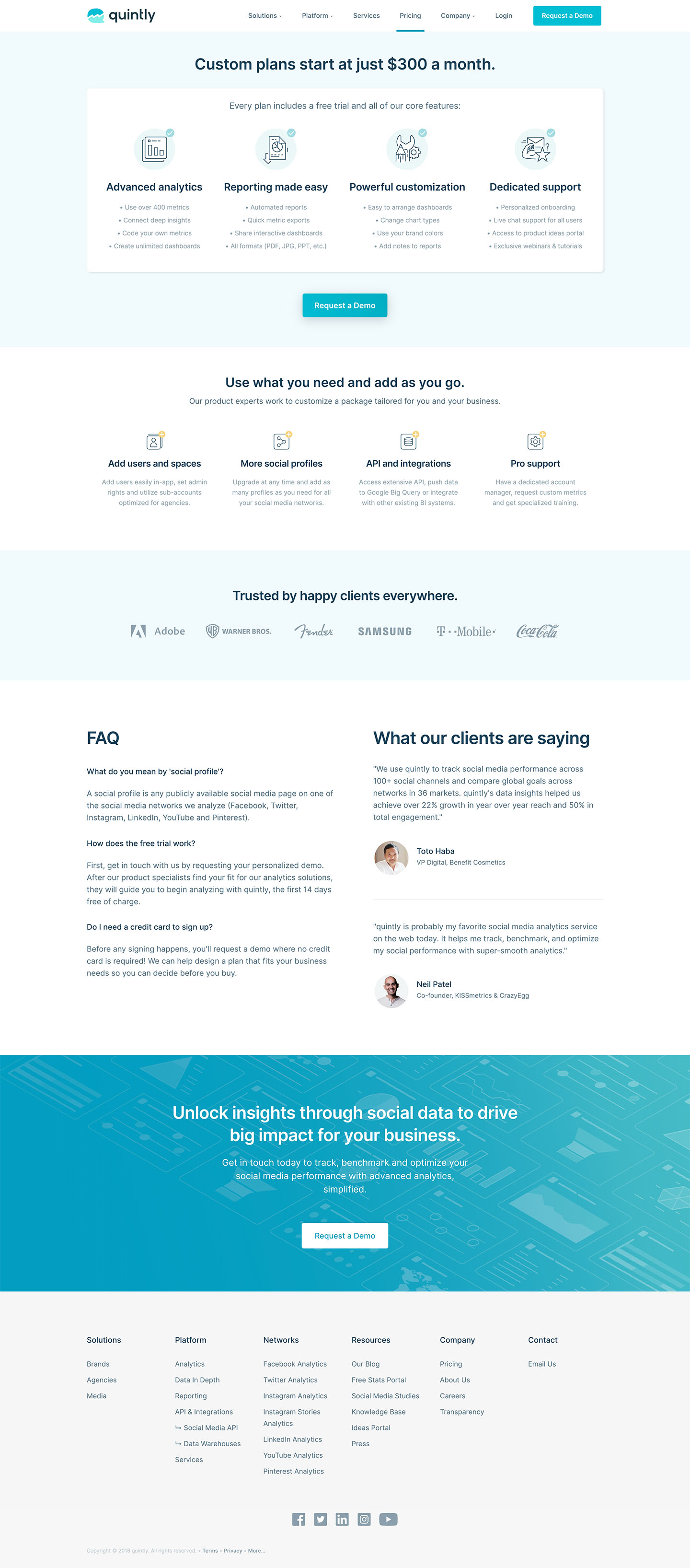
One of my biggest undertakings at quintly was redesigning and launching the new website. Research, mock-ups, feedback, testing — a lot of rewarding work that resulted in an increase of 44% more traffic in the first year.
Home Page — Desktop

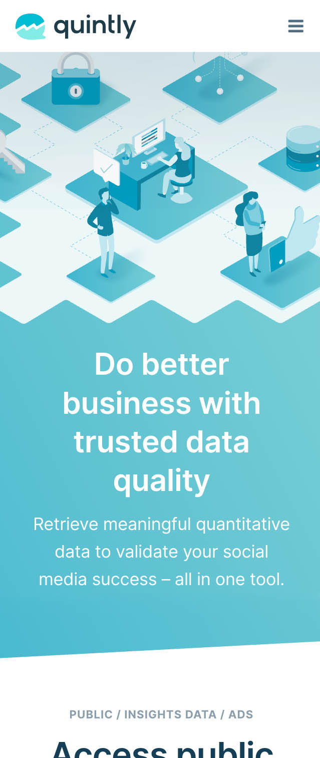
The project included reassessing brand positioning to better define our product features and solutions for a vastly improved user experience. (Try scrolling in frames to see more.)
Landing Page — Mobile
Request a Demo — Desktop
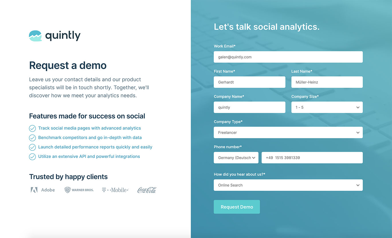
Competitive analysis, SEO, strong copywriting and mobile responsiveness were all significant aspects of the project for myself with assistance from members of our Growth team.
Pricing Page — Desktop
Pricing Page — Mobile

A clear, professional brand identity was essential for quintly to compete in a crowded market. I created detailed, flexible guidelines built to grow and help unify brand experiences.
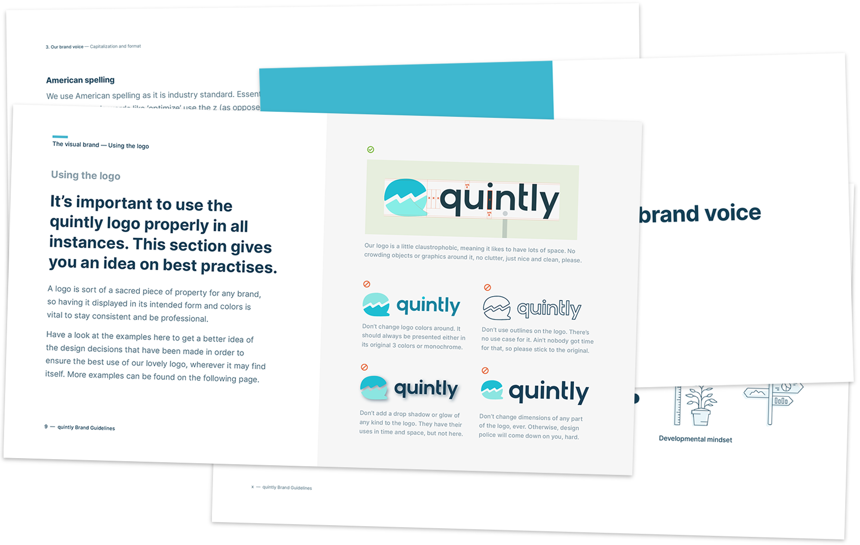
Arguably even more important than the visual styles was an overview of best practices for communications and customer-facing teams. Consistency and clarity of voice was imperative.
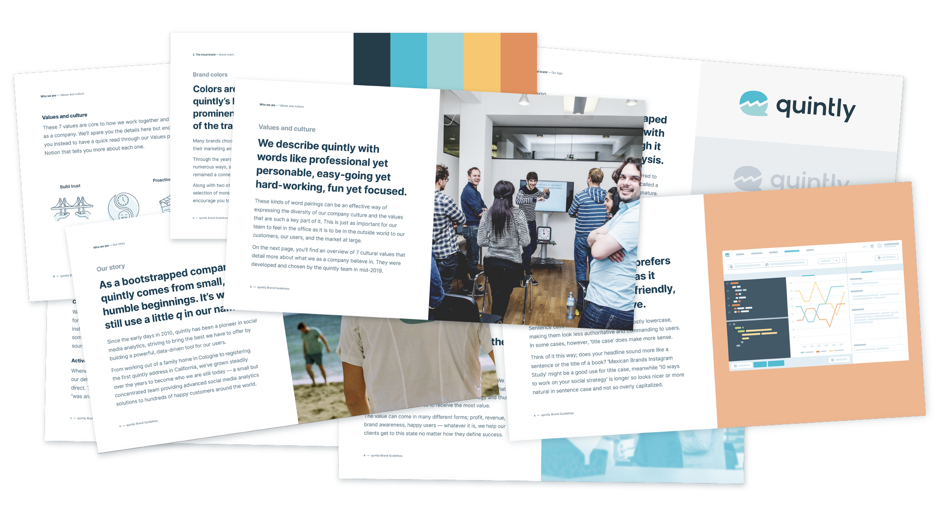
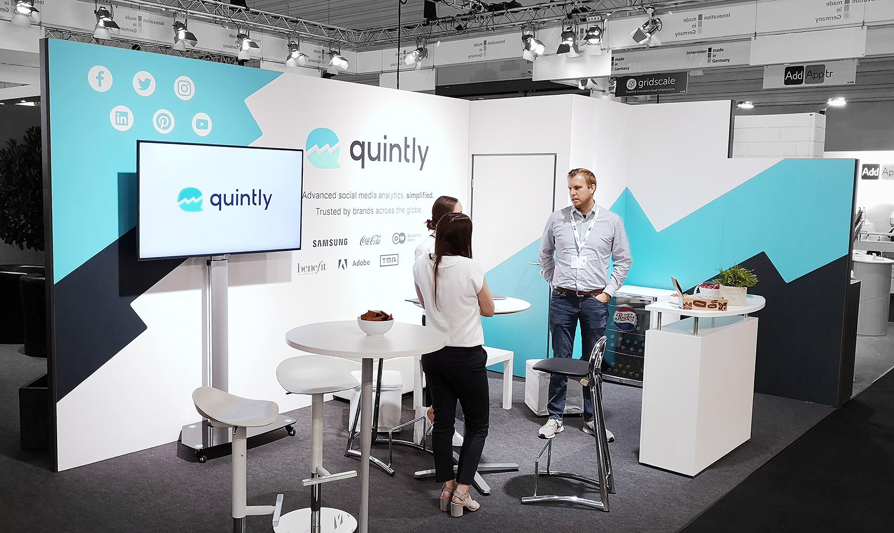
Guidelines helped us to scale our brand identity from big event booth designs right down to the finer details of the new logo, which I created as a much-needed refresh for quintly.

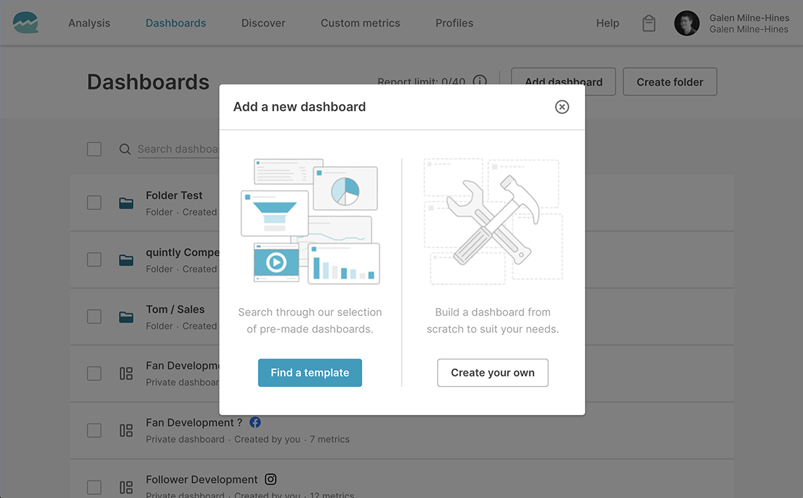
I helped kickstart a redesign of quintly's product, assisting in the early development of a new design system, contributing brand UI colors, font classes, icons and much more.
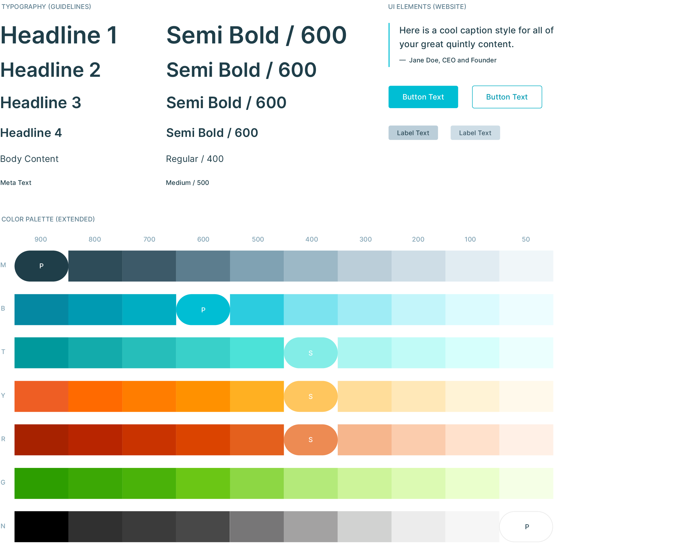
We brightened the brand palette and tested for accessibility, maintaining a consistent use of colours in content to make users more easily familiar with our brand and feel confident in our company with our trademark blue.
The scope and context of content informed how much I would keep certain pieces on-brand or not. In general, the dramatic rise in popularity for illustration at SaaS companies inspired me to experiment when I could, most often for our blog.
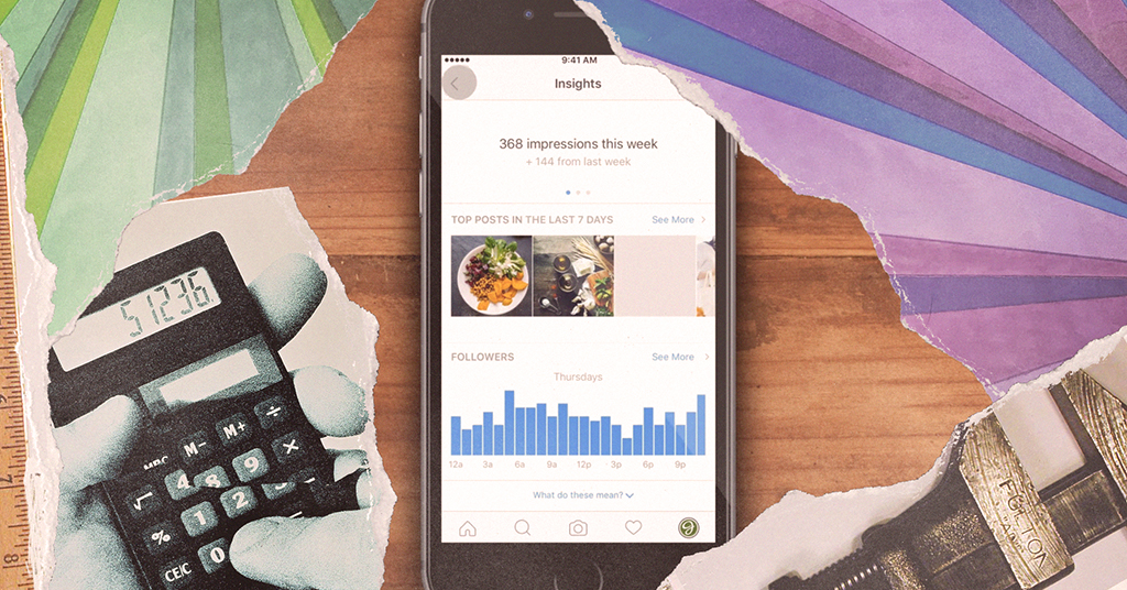

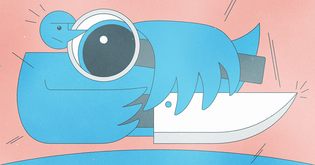

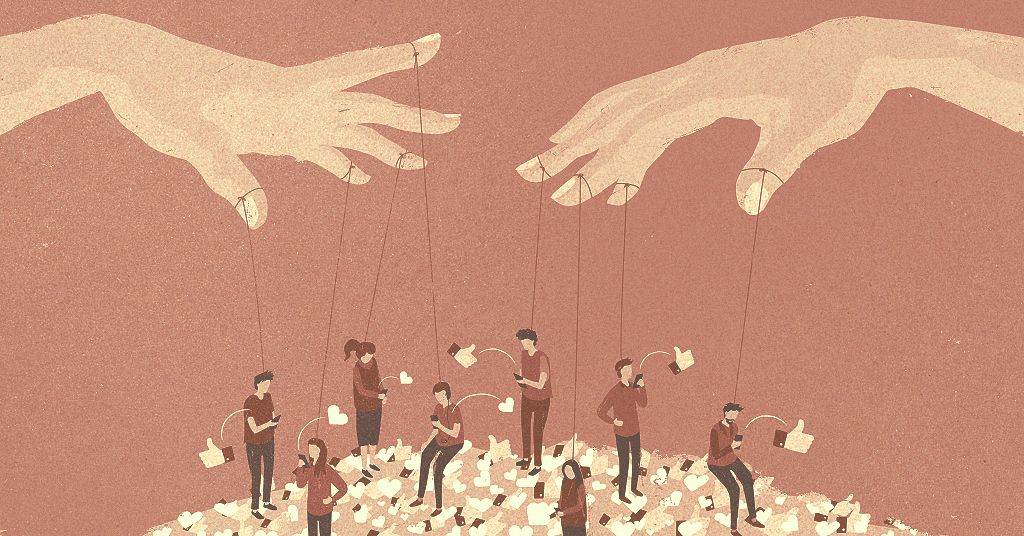


Overall, illustration was an important avenue for me to explore trends for our brand and express creative, human ideas into an otherwise highly technical and data-centric platform.
My time at quintly wasn't just about design. It was digital marketing, data analytics and the complicated relationship between a company and its product, the market and our users. My experience and learnings from these are something I greatly look forward to taking further in my career.
As a relatively small team, it was an amazing opportunity with a lot of responsibility, having to take initiative and ownership on a wide range of projects. Building trust, getting feedback and fostering company culture were also incredibly important points for me and our team along the way.
A huge thanks to the senior designer before me, Alina Kodatko, whose work paved the way for our time there. Also to Chris Day for his extensive UI work and friendly support. Our UX designer was Erica Chen. To my design interns along the way; Zigmas, Mohamed and Ryan — thank you all. Last but not least, to the rest of the team. 🙏
COPYRIGHT © GALEN MILNE-HINES / BONHOMIE, 2019
THIS SITE WAS BUILT FROM SCRATCH. NO TEMPLATES — JUST COFFEE, CODE AND GRIT.